Home
About
Contact
Instagram
Home
About
Contact
BET
Jollies
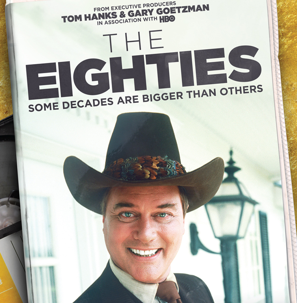
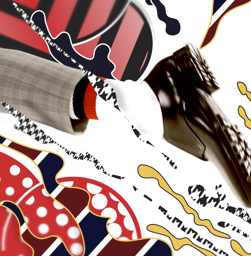
CNN The Eighties
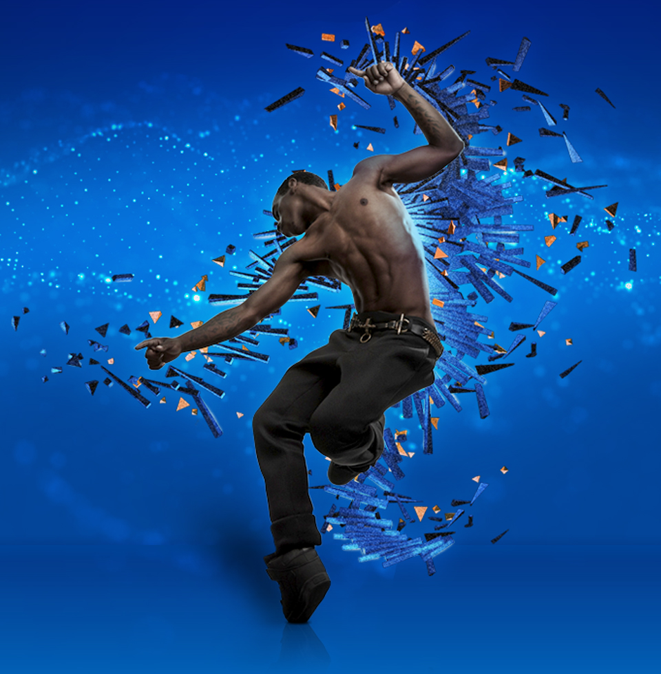
AIR + STYLE
Print & Digital Layouts
Nordstrom
Intel
Styleframes
Logos & Lettering
Illustrations